...As has been evident to any readers who still visit here, I decided to stop posting here, and instead I've created a new, comprehensive site, for blogging and galleries and so on.
I hope to post some new"Scientific Artist" type material there, too.
So, please adjust your bookmarks, and come over and visit me HERE!
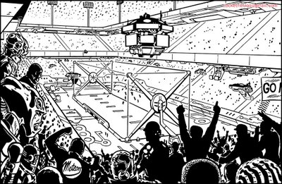
I was looking over old work---always an interesting exercise---and came across the black and white art I did for DC's "Legion Worlds" miniseries. The panel shown here was from page ten, and it prompted a few thoughts about problem-solving, making choices, and creating the suggestion of depth.
I'm not sure this image is the best one I could pick to illustrate my topic (because there are a number of things I'd now change) but since it's my work, I know it, and remember enough about it to be able to explain it, so that's what I'll use.
The script called for me to draw a vast crowd scene in an alien stadium, introducing the general scene as well as the fact that the game being played down below was a 3-dimensional floating sort of enterprise. There also had to be floating scoreboard and cameras, falling snow, etc, etc. In short, the kind of thing that can be pretty challenging. I realized that in order to be able to present all this without the image being hopelessly busy, the camera angle had to be chosen carefully.
Consider the problem of presenting the crowd. Too distant a view, and all the figures would be too small to be of interest; furthermore, none would be close enough for some to be identifiable as alien, which is something I had to show. On the other hand, too close a view and the figures would fill the frame, obscuring the more distant figures and details and therefore killing any sense of depth.
After some experimentation, I settled on what you see here: a few foreground figures, hit with light, close enough to see that they're aliens; then a quick slide into silhouettes and darkness, and continuing beyond that to the figures just being suggested by random dots. Having the foreground figures stand up helped block just enough of the background so as to simplify the drawing task--ie it eliminated having to draw dozens of fussy midground figures---yet still left enough gaps which left visible the details in the distance.
The main idea, for some reason, was this: that in drawing, one must simultaneously keep in mind both the general and the specific---a sort of juggling process, one of many pairs of opposites which must be held in balance and reconciled as you proceed.
As you draw, you assume a god-like power of creation. You create small details, as well as the larger structures which those details fit into. Or to put it another way, you balance both the macro and the micro; keeping one eye on each, as it were, as you move along.
You must somehow become comfortable with both views of the world, and with the “world” which you create on paper, in order to succeed. However, everyone has a natural disposition, it seems, which can sometimes be obstructive; a tendency towards “detail thinking” or towards “structural thinking”.
If you forget about one, or obsess too much about the other, trouble often comes. Imbalance. That’s what I’ve found, looking back on pieces of artwork which I now see as failures. Too much detail, without enough creative effort first on the structure which holds it all together, and you get a rambling unfocused assemblage of pieces-but-no-glue. You emerge from a morass of details, step back and assess, and to your horror you realize: the thing’s not hanging together as a whole. Then you chop it, change it, wrap bandages, or even throw it out and start over, sadder but wiser…
And on the other hand, if the drawing has lots of structure---broad design thinking---but lacks in convincing detail, then it doesn’t “sell” itself to the audience; it’s never quite believable enough. It’s too general. And you arrive in a similar place: realizing that the thing’s just not working, not as well as it could. Perhaps this is an easier problem to fix than the first. You can add detail, sometimes, on top of a structure that works, but trying to retrofit the structure into a mass of unarranged details is an exercise in heartache.
It’s kind of like those Russian stacking dolls: the smaller ones will fit into the larger ones, but not the other way around. Or taken another way, it’s like packing your car’s trunk, or closet, with a group of suitcases of various sizes, and trying to have them all fit in: you learn to place the big ones first, then sequentially fit the smaller ones into the gaps left, until you’re done.
It’s common, and easy, to start with details, thinking of them first, losing ourselves in them. We first encounter life this way, as children. We don’t fly over the landscape as does a bird, and see the larger wholes, from afar, presented to us---we’re down on the street, moving along, we have to figure the bird’s-eye-view out for ourselves as we get older. In daily life we see an endless procession of details, all from our limited vantage point, and we sort through them looking for order and arrangement and meaning---looking for the larger structures.
In creating a drawing, it’s the same thing, just moving in the other direction: from the general to the specific.
It takes another kind of thinking, a sort of abstract vision, to perceive the larger structures at work behind the many details provided by the vision of our eyes. While drawing, one must balance both perceptions. This hidden aspect of drawing helps keep it endlessly fascinating.
I love lines. And lately, I miss it them on the big screen: I miss the magic of caricatured lines-in-motion.
I admire 3D animation when it’s done well, by Pixar and others. But to me it still lacks something. For a long time I puzzled over this and couldn’t quite explain it to myself. What was the absent element?
Finally, as obvious as it sounds, I realized that they have no lines. It’s not that these films are no longer something vaguely defined as “2-D”; it’s more exactly that they have no outlines.
Lines. Good old outlines. They took them away, and added a whole bunch more lighting and rendering and usually unnecessary camera movement, and called it “3-D animation”.
Yes, in creating this brave new creature, they threw away the lines, locked them in the garage, to cower ignominiously, ignored. They ripped those weak, spindly outlines away from the forms they enclosed; forgot about them. Dropped them.
At least, they dropped them from the final product. But the artists themselves haven’t forgotten them; you look at all the “Art of…” books released in conjunction with 3D films, and you can find endless beautiful outlines. The artists still know the ultimate power of the line: and often, in my opinion, the art in those books is more engaging than the actual films themselves. Personally I often look at a piece of art in one of those books and say to myself, “I wish this was in a picture book, or a comic, or a so-called ‘2-D’ version, drawn just as it is here, in all its graphic simple beauty!”
Lines. I love them. In all their simplistic, no-tech glory, I love them nonetheless.
Outlines: lines around things, enclosing shape and suggesting forms. Stipple lines. Hatching lines. Pattern lines. Pen lines, brush lines, marker lines. All the endless sorts of lines, straight, sinuous, pointed, long short, and broken…
They have a pure distilled-down magic. Suggestive and symbolic, they don’t exist in reality. They promise and prompt and then let the imagination of the viewer fulfill the rest, actively bridging the gap. They engage the mind!
In the hands of many past masters, such as Milt Kahl, Marc Davis, Bill Peet, Ken Anderson, and so so many others, we were treated to the unfettered glories and suggestive powers of the line, whether still or in motion. On the big screen, we tasted the singular delight of caricature-line-in-motion. And the amazing spectacle of the background layouts in 101 Dalmatians, with their raw, naked lines, brazen and unashamed.
It’s a specific flavour, a graphic taste, that can be gotten no other way, and when you know and love that flavour, you have to have more of it. You watch classic films such as The Jungle Book, or for that matter The Iron Giant, for their story and acting and character, of course; but beneath that, you watch and enjoy the beauty of caricature-line-in-motion, for its own sake. It adds enjoyment as a language all on its own.
I have nothing actively against so-called “3D” and films made that way…but I miss them, the good old outlines, and the worlds they conjured...
For what it's worth, here's something I realized tonight about drawing, while drawing.
Too often one can draw at a speed dictated by the mind. For example, if the mind is racing and agitated, then often the hand follows and draws at a frantic pace, in disjointed bits and pieces which reflect, on paper, the mental state.
Or the reverse: sluggish mind, sluggish hand. In both cases the results can be unsatisfactory and disjointed.
Noticing this, one can attempt to intentionally counteract it. When the mind is racing, the hand can be slowed down, the drawing done with attention and deliberation and nuance. Or, when the mind is slow and feeble, set the hand free and draw much faster, without pondering and watching. This may shock the mind and bring forth more clarity.
Perhaps this is why it's difficult to make a hard-and-fast rule about the speed at which one should draw: it depends on what works best in conjunction with the pace of the mind, at the moment of drawing.
Thanks for all the interesting comments about "Holding the Brush". I will post a small followup of thoughts asap, although the comments covered everything very well.
Two shots of slightly different ways to hold the brush while inking...just from looking at these images, what do you think is the difference? Which position (if any) is superior, and why?
Apologies to those who've been checking in here, for the lack of fresh content...frankly, creating content for this blog is a lot more time-consuming than for my other two blogs---not hard to guess, right? However, I am working on new material and hope to have some posted soon. Again, thanks for visiting and...see you soon!
I love being a channel for creativity and since roughly 1979 I've been creating comics covers and pages, graphic novels, animation background designs, illustrations, and more.