Crowded Thoughts
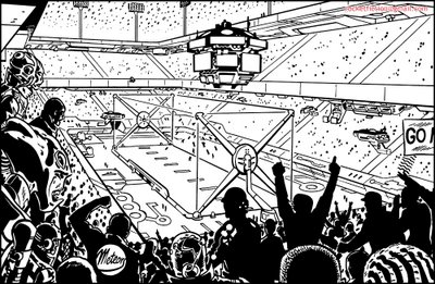
 I was looking over old work---always an interesting exercise---and came across the black and white art I did for DC's "Legion Worlds" miniseries. The panel shown here was from page ten, and it prompted a few thoughts about problem-solving, making choices, and creating the suggestion of depth.
I'm not sure this image is the best one I could pick to illustrate my topic (because there are a number of things I'd now change) but since it's my work, I know it, and remember enough about it to be able to explain it, so that's what I'll use.
The script called for me to draw a vast crowd scene in an alien stadium, introducing the general scene as well as the fact that the game being played down below was a 3-dimensional floating sort of enterprise. There also had to be floating scoreboard and cameras, falling snow, etc, etc. In short, the kind of thing that can be pretty challenging. I realized that in order to be able to present all this without the image being hopelessly busy, the camera angle had to be chosen carefully.
Consider the problem of presenting the crowd. Too distant a view, and all the figures would be too small to be of interest; furthermore, none would be close enough for some to be identifiable as alien, which is something I had to show. On the other hand, too close a view and the figures would fill the frame, obscuring the more distant figures and details and therefore killing any sense of depth.
After some experimentation, I settled on what you see here: a few foreground figures, hit with light, close enough to see that they're aliens; then a quick slide into silhouettes and darkness, and continuing beyond that to the figures just being suggested by random dots. Having the foreground figures stand up helped block just enough of the background so as to simplify the drawing task--ie it eliminated having to draw dozens of fussy midground figures---yet still left enough gaps which left visible the details in the distance.


8 Comments:
Cool post Paul! I've been busy too, so I've not been on the www for a while.
This is great how you described your approach to the fore/midground of the crowd...I probably would've made a muddy mess. The quick slide into black, then dots! So simple, and clear. Nice one.
Please post some more of these types of problems if you get the time! I found the copy of Tom Strong you did! Fun to compare the final to what's here!
Cheers!
I know little about comic visuals, but their complexity hidden in their apparent simplicity has always surprised and intimidated. Fascinating to see a great image and read the process and considerations.
you mention in your entry:
"I'm not sure this image is the best one I could pick to illustrate my topic (because there are a number of things I'd now change)",
i wonder what would that be? is there something in the pic that you think could work better if you do it differently?
And please post more problem solving entries¡¡
This reminds me of the old 2000AD story 'Harlem Heroes' Cool pic !!!
The statements were well put and clearly true in every detail learnt alot from reading this and the image loking forward to meeting u take care!!!
sorry for not coming by here in awhile.
Great post Paul, love the dissection and step by step of your thoughts on this. Hope you've got more planned ;)
http://www.pthamster.blogspot.com/
Hi Paul!
I'm a italian boy...
Please, visit my BlogSite:
www.heroclip.blogspot.com
For Comic-Books & Illustration Fanatics!
PS: Sorry for my english!
Post a Comment
<< Home