Pencilling, Inking, and Non-Repro Blue

Since I mentioned it on my “Rocketfiction” blog, a number of people have e-mailed me to ask about my method of printing “non-repro blue” onto art board. For anyone who hasn’t heard of this, it’s a very helpful shortcut which is allowed by improvements in desktop printers. I didn’t invent it; as far as I know many people in comics and illustration routinely use some version of the method outlined below. There are many variations of it…here is mine.
Let’s say you have a drawing (ranging from a scribble to a rough to a more detailed drawing) which you really like, and want to ink, but it’s not on suitable paper for inking and putting down lots of black; or perhaps your sketch is drawn too small and you want to ink it larger; or, you have a tiny series of thumbnails and you want to blow them up to comic page size, tighten them up, and then ink them. In the “old days” you might enlarge your sketches and get them onto art paper by several different methods, all of which were time-consuming: you could “grid” them up, or use a photocopier and enlarge them and collage them and then trace all that through your paper (if it was transparent enough, that is); or, you could buckle down and just re-draw the entire thing from scratch.
But in all of those cases, you spent a lot of time, and risked making unwanted changes to the rough you loved, perhaps losing some of the “magic”…and if nothing else, by the time you were ready to ink, the inking would be at least the third time you’d drawn the entire thing! Talk about repetition!
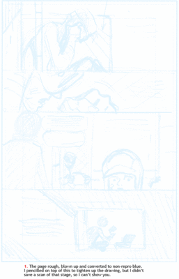
With the recent advent of improved desktop printers, you can now get to the inking stage much more quickly. Here’s what I do: I first assemble my rough material in Photoshop. If it’s a single illustration, “assembling it” might mean blowing it up to a larger size for ease of inking, as well as re-positioning any elements that bother me. This stage might include making a head larger or smaller, or fixing the eyes, moving a limb, or even in an extreme case chopping out a foreground element entirely and moving it relative to the background. If it’s a comic page, you might change or rearrange panels, using layers to make things easy to adjust. The computer affords the possibility of making any and all changes necessary to get the drawing to the point where I’m comfortable inking it.
A thing to note, at least in my own personal approach to this, is to concentrate more on getting the major elements in place in a broad way, rather than fussing with the smaller details and nuances of the drawing. I’ll save that sort of thing for a later stage---I find that if I bog down too early in drawing details, the illustration can become boring, and it then makes the inking stage too much like tracing. I like to leave just enough drawing to be worked out in the inking, so that I have to draw as I ink, not just unthinkingly trace lines and shapes. Of course the flip side of leaving this gap is that you always have to stay with the work; a lapse of attention, ie lapsing into mechanical “tracing-inking”, means you can quickly botch the piece up.
When the rough assembly is ready to be printed onto final art paper, I save a new file of it in Photoshop, flatten the layers in the file, and enlarge it to the needed dimensions, usually allowing for “bleed” around the edges. Usually I change the resolution so that at the larger size, the resolution is about 150 to 200 pixels per inch. This is enough for printout onto the art paper. I then convert the file from grayscale to CMYK color. After that, in the “channels” palette, I delete the black, magenta, and yellow channels, leaving only cyan. Next, I want to fade the cyan so that the darkest cyan is no more than about 12-20%. In other words (and here I am speaking of a rough consisting only of linework, not tones), all the lines in the image will end up roughly about 12-20% cyan. There will be nothing other than those light blue lines, and white paper. You ink over the light blue lines with black, and when you later scan the art in “bitmap” mode, the scanner will not pick up the blue, leaving only the clean black.
To fade the cyan lighter, I quickly make a new layer on top of the sketch in the “layers” palette, fill it with 100% white, then fade the opacity of the layer until, testing the blue with the eyedropper tool, I have the percentage of blue which I want.
One note: you have to experiment and find what works best for your particular printer and scanner and paper. With my setup, and my personal taste, I find that a 12% cyan works out perfectly, because it is just dark enough to still see clearly on the art paper, but light enough to be easily drawn over, and not show up on the scanner.
With the blue adjusted, I then print out the image onto art paper. I have an Epson 2000 inkjet printer, which accepts reasonably thick paper and also larger paper sizes---so I can print out onto, say, Strathmore 2 or 3-ply paper at 11 x 17 size. There are surely many similar printers which can print large and accept thicker art paper.
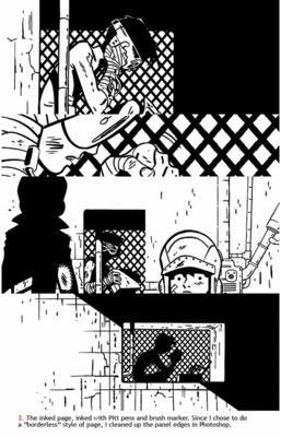
Once the image is printed, I often lightly go over the drawing with a regular HB pencil, tightening up any areas of the drawing which need it; as noted above, I still leave it loose enough so that I have to draw as I ink. The goal is that leaving this bit of unpredictability keeps the drawing alive…

Once inked, I erase any grey pencil from the board, then scan the art in bitmap mode at a minimum of 600 pixels per inch, often higher depending on the job…

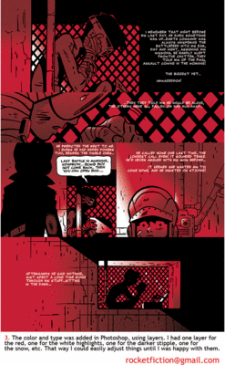
That’s about it: took a while to explain in words, but once you’re in the routine of using this method, you’ll find it saves a huge amount of time, while increasing your creative options.


