Thoughts on Cover Composition
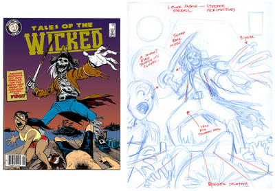
 From time to time, I may do slightly different posts, such as this one: my friend Warren Leonhardt, animation storyboard artist, e-mailed me asking for input on his comic cover art, shown above:
Hey Paul,
Just wondering if you could (one day) make a fast crit of this mock-up I did for kicks.
I pencilled, inked and coloured it in a 17 hour workday. First time taking an image to completion (at least in a mock-up); first time using Photoshop to colour anything - just winged it using the 'Draw!' tutorial in issue 9...I figured on trying to make the deadline as 'real' as possible, just to see how far I'd get...and there's a few mistakes, for sure. I'm trying to zero in on my most consistent ones, using 'sounding boards' like yourself, if you feel like it.
Cheers,
Warren.
And here’s my answer, lightly edited for the blog:
Hi Warren,
Sorry about slow response...
You did pretty damn good if that was yer first time with Photoshop...good for you!!
Overall it is very fine and impressive.
I'll only focus on quibbles, since you asked for my opinion...that's all it is, opinion, I think that this is already way better than a lot of published covers I see out there.
Anyway: here it is. I'm writing a bunch because this stuff interests me… usually I like to critique a rough, not a final, since then the advice has a chance to be used. But anyway…
Overall I think the storytelling of the cover, while reading well, could still be enhanced a little. For example, it looks to me like the story shown is that a couple are at a lake, they’re on the dock drinking beer, and then a skeletal pirate zombie arrives and chops off the guy's head, and is now scaring us (the audience) but chasing girl, who's next to be threatened.
If it's meant to be a cottage/lake setting, I can't tell if those three dark masses behind, on the water, are islands with pine trees or some kind of slime masses coming out of the water...they need to be drawn more clearly—carefully drawn silhouettes would convey a lot. Also, I find having three separate masses, and centering the middle one under zombie, too eye-catching. It’s a background element not important enough to deserve that amount of attention.
Did the zombie pirate just come up out of the water? Then probably, to tell that part of the story clearly, he should be dripping and more slimy...makes him scarier and gives it immediacy, ie that he only moments ago popped up out the h2o. (I didn't show the water in my little attached sketchie, thought of it after I drew it!!)
I like the sword and its rustiness, but if the blood is fresh on both sword and dock, which I imagine it is, then it should be much brighter...only "old blood" is dark. Conversely, the girls pants are bright red and thus eye-catching, but the pants are not really important. So to draw the reader's eye to the sword and blood and tell the story, you should in my opinion make the blood the bright red like the pants, and make the pants the dark red---switch them.
I don't find the blood spatter convincing on the body...could be mistaken for chest hair or something...you can find clear photo examples on the net to give more exact guidance on the pattern.
If the pirate is about to chop her next, he should be clearly looking at her. Since you don't have eyeballs to point with on the skeleton, its whole head might have to be pointed straight at her to show he's looking at her. Right now he's looking at camera but why would he stare at us? He vants the girl!!
If they were in mid-beer drink on the dock, which is a good storytelling detail because it shows they were suddenly interrupted, maybe you could have a spilled can in there somewhere.
Then: on the compositional side, see my quick sketch. I think you can push the perspective a lot more in order to create more drama. You want to direct the viewer’s eye to focus on the pirate, the most scary thing, while still circulating around the page and highlighting the other key elements. So maybe it would help to have a lower overall angle, more upshot on the pirate, a steeper perspective on the deck. The radial lines (fan-shaped) found in steeper perspectives give more dynamics, more energy, than flatter angles. It might be a nice idea to get the camera in a bit closer, so we are right in the action. Also, right now the three masses as visual shapes (ie girl, zombie, dead guy) are too equal, which is dull and static. Probably girl should be moved out a bit more and up and bigger...right now she looks too small to me. In my opinion you don’t need to show all of her---the space to the left of her is distracting, it kind of traps the eye. It wouldn’t hurt to show her neck veins bulging, since she’s up next for the zombie’s sword.
I haven’t shown it in my quick rough, but more dramatic lighting or even a rim light on the pirate, would probably heighten the drama a lot.
My suggestions are only a quick take on this and not at all presented as the only “right” one (there’s no such thing)---it’s intended more to show other possibilities.
Thanks Warren, for graciously agreeing to share your work!


2 Comments:
Fun looking image!
Chad! How have you been?? The Blogosphere just got smaller!
Post a Comment
<< Home